It pains me to say this, but these review-encouragement ideas aren’t mine: Other people told me (or reminded me) about them recently.
We’ve walked step-by-step through what your strategy should be. We’ve looked at which review sites you should focus on. I’ve even breathed down your neck to keep you motivated.
But maybe you’ve got the basics covered and want some next-level ideas – ways to get more out of your current efforts to get reviews. I’ve got 3 of those for you.
They’re “advanced,” but they’re not hard. You can work them into your current strategy quickly and almost invisibly (without having to change your strategy). That’s why I call them “ninja moves.”
Ninja Move 1: Feature your Google+ reviews in posts on your local page.
Darren mentioned the Blue Plate Diner in Edmonton in a recent comment, at which point I noticed the review they showcased in their “posts” stream.

This is a subtle way to encourage any customers who see your “posts” stream to write you a review. But it’s more important as a way to broadcast your existing reviews a little more.
It’s also wise to showcase your reviews in your posts because anyone who clicks on the link to your Google+ page in the main search results will be taken straight to the “posts” tab of your page.
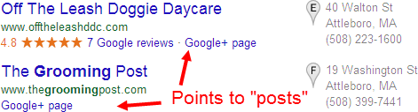
How do you feature a review in a post?
Assuming you’ve got the “upgraded” type of Google+ Local page, you first go to the “About” tab on your page and find a review you’d like to share.
Let’s use my poor, neglected local page as an example, and let’s look at the overly generous review by Angela Wright MBE.
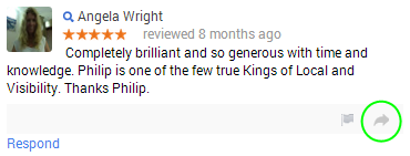
If I were smart, I’d click the “share this review” arrow, and put the review in my “posts” stream. That’s it.
Oh, and in the post you’ll want to thank your reviewer, as Blue Plate Diner wisely did.
Ninja Move 2: Hard-laminate any printed instructions you give to potential reviewers.
“But lamination is expensive.”
“I don’t have time.”
“I don’t have a laminator.”
“Why can’t I just email customers to ask for a review?”
“Get with the times, Phil. If it’s not an app people don’t use it.”
Phooey.
Texas dentist Mike Freeman told me about this approach, and it’s brilliant. Simply laminate whatever paper instructions you use to show your customers, clients, or patients how to leave you a review.
(Dr. Freeman ordered my battle-tested Google+ review handout, but you can laminate whatever instructions you like.)
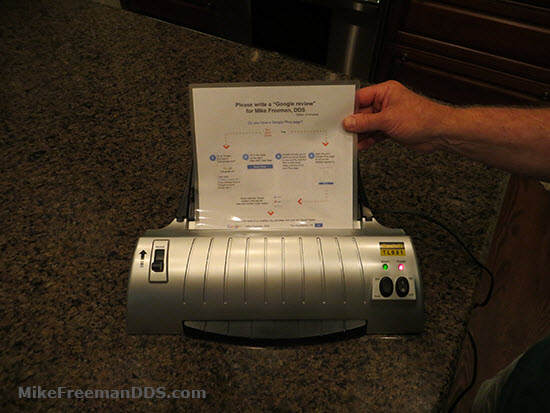
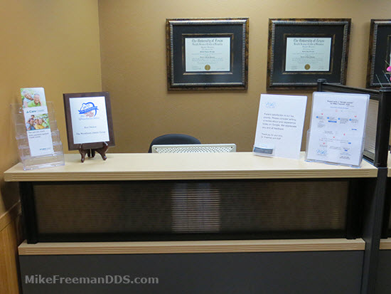
You don’t need to laminate hundreds of copies of whatever instructions you use. Try it with a few and see what happens.
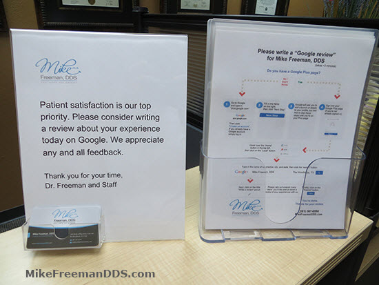
The lamination accomplishes three things: (1) it makes the instructions hard to crumple up or fold up, (2) it makes them harder to lose in the sea of papers and bills on the kitchen table, and (3) it makes your request seem better-planned-out and more sincere.
It may be a professional touch, but it’s not expensive. As Dr. Freeman told me:
“Laminators can be purchased on Amazon for roughly $30 and the plastic pouches cost about $20 for a pack of 100. A very low investment on what could potentially help a small business gain a lot of reviews.”
Ninja Move 3: Use Yelp’s “Find Friends” feature to identify active Yelpers.
This is another stick of Darren dynamite (see this and this). As he, I, and others have written, the big factor that determines whether Yelp reviews get filtered is how active the reviewers are. Anything written by a first-time reviewer probably won’t see the light of day.
So how do you find customers who at least already have Yelp accounts? Log into your Yelp account and go to go the “Find Friends” area (https://www.yelp.com/find_friends/address_book).
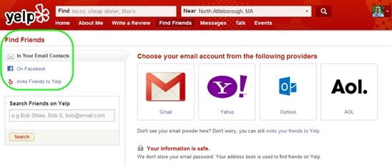
This feature won’t help you much if you have no contact with your customers – by email or on Facebook. But if you don’t have any means of reaching them, you’ve got bigger problems than reviews.
Yelp doesn’t want you even to ask for reviews. I’m not alone when I say that’s a stupid rule, but that’s the way the cookie crumbles. What you do with any “active” Yelper-customers is up to you. This is just the best way to identify those people.
—
Have you tried any of the above? How’s it worked out?
What are some “ninja” review moves that have worked for you?
Leave a comment!